The
Art of Design, Shadowfist-style
Home
> Design Notes > Art and its influence on
card design
[posted 1 Jul 2003]
This article started
out as a reasonably well-focused attempt to relate a couple of anecdotes about
art and how it influenced card design during Throne War playtesting. But there
were just too many things to say, so it's grown a bit :) Let's start with an
overview of how card art is created; if you're familiar with this process, skip
to the stories below.
How Card Art
Is Created
First of all, you
need someone to coordinate with the dozens of artists who'll be working on the
set. CCG companies typically hire a person to act as art director, or artist
liaison as Ed Beard likes to call it. That person's job is to coordinate production
of the art with the various artistsassign pieces, provide background material,
coordinate the delivery schedules, and approve/reject the finished art. Sometimes
they also handle contracts and negotiations, sometimes that's done by a business
guy. The art director might also scan and color-correct the finished pieces,
or not, depending on the details of the arrangements.
| CDCA
Scientist |

We
see the exterior of a futuristic building, about 3-4 stories high. From
one of the upper stories, we see an explosion blowing out a window, more
or less toward our point of view. At the forefront of the explosion, as
if he's been propelled out of the window, we see a middle-aged male in
a very singed lab coat flying toward us, his arms and legs bent a bit
backward by the force of the blow. His glasses/goggles are flying off
of his head, his lab coat is undone and flapping behind him. But his expression
is of pure satisfaction; in one hand he's clutching either a beaker with
a brightly colored liquid, or a sheaf of notepaper. (his discovery) He's
not even thinking of how much it will hurt when he lands....
 Most descriptions aren't anywhere near this detailed, but I had this image
in my head of what this card should look like, so I wrote it all down.
And Stephen Snyder nailed itmy favorite piece from Year of the Dragon.
Most descriptions aren't anywhere near this detailed, but I had this image
in my head of what this card should look like, so I wrote it all down.
And Stephen Snyder nailed itmy favorite piece from Year of the Dragon.
|
Next, the artist
needs to have some idea of what's needed for each piece he/she's assigned. The
art director uses a short writeup called an "art description" to tell the artist
what a card should look like. The descriptions range from one sentence to a
long paragraph, depending
on what's needed to get a particular piece "right" (any
truly important details must be written in the description, I learned
that the hard way). The artist also gets the card title,
type, and faction along with basics like the size and shape of the finished
card. The art director also provides background material; for example, if a
card requires that Gao Zhang appear in the art (like Sinister Accusations),
that artist gets a look at the Gao Zhang character card. The artist isn't completely
bound by the description, but the more he/she strays from it, the greater the
chance that the final piece will be rejected.
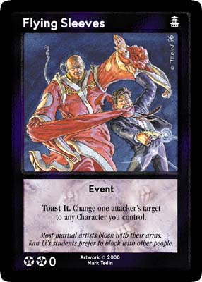
| Flying
Sleeves |

Evil
Lotus Eunuch in robes with arms outstretched. His sleeves extend many
feet past his hands and are strangling a Dragon hero.
 If you don't have something very specific in mind, it's best to leave
the description simple and let the artist do his/her thing. This particular
piece by Mark Tedin was originally commissioned for Flashpoint in 1996,
but wasn't used until Z-Man printed Throne War in 2000.
If you don't have something very specific in mind, it's best to leave
the description simple and let the artist do his/her thing. This particular
piece by Mark Tedin was originally commissioned for Flashpoint in 1996,
but wasn't used until Z-Man printed Throne War in 2000.
|
When the art comes
in, the art director reviews it, then passes it along to the boss (in this case,
Zev). If they're both happy, the piece is accepted and the artist gets paid*.
They might send the piece back to have some adjustments made, or in rare cases
a piece gets rejected outright.
*
Daedalus developed quite a reputation among the artists for slow or no payment.
Keep that in mind if you want to talk about Shadowfist with artists from the
Daedalus sets, it might explain the bad attitude :)
After the art is
accepted, it's scanned, then corrected if necessary (color corrections, sharpening,
etc. If you've worked with digital photos then it's similar, and if you haven't
then you probably don't care anyway :). The scanned art is then cropped to size
and placed in the appropriate template for its faction and card type. Voila,
a card blank is born, ready for text.
Timing is Everything
One more sidetrack,
then it's on to the real story. Before we get to art and how it influences card
design (and vice versa), you need to know a little about the playtest process
at Z-Man. Most of the bigger companies like Wizards and FRPG do advance (in-house,
usually) playtesting, so the cards that go to the at-large playtesters are pretty
much set. They expect to print those cards, with maybe a few tweaks based on
the at-large playtest results. Those companies often have art commissioned,
and sometimes even delivered, before at-large playtesting starts.
At Z-Man, there
was no separate in-house playtest. Instead, we used a system where the at-large
playtesters saw and tested a wide variety of cards, and we planned to cut a
fair number of those cards before print (or punt them to later sets if they
were looking good). Art wasn't commissioned until as late as possible in the
cycle, so we could make a good estimate of which cards would survive playtest
and see print. That's great from a card testing perspective since it gives you
more time to refine cards, but it really puts the pressure on the art side since
there's very little time to recover if the art doesn't quite work out. And there
are lots of reasons why it might not worksometimes the card text changes after
the art is commissioned, sometimes you just don't like the piece when it comes
in, and sometimes the artist takes a few more liberties with the description
than you can reconcile with the card title or its text...
The
Art of Card Design vs. The Design of Card Art
In theory, the
route from card design to art design is a one-way streetthe card design and
name determines the art. Someone familiar with the card's chrome
writes an art description that emphasizes what the card is, or what it does,
and the artist puts something like that onto paper for you.
In practice, the
art description is never quite that airtight (nor do you generally want it to
be, since you'd like the artist to have room to do, well, art, with his/her
own take on the theme) so the art you get back rarely matches what you imagined
when you wrote the description. Sometimes that's better and sometimes not, but
either way, it turns out that the art can shape the card, too. When you finally
see the art, you might want to change the card's ability or its title to better
fit the art.
Another avenue
open for art to influence design is the use of "leftovers." Art that was commissioned,
accepted and paid for on previous sets but not used for whatever reason is just
begging to be used in the current setbesides the fact that it's already in
your hands, there's a sizeable monetary incentive to use what you've got rather
than commissioning more. With that art as inspiration, you might try to design
a card to fit it, which sometimes is easier said than done.
Of course, I have
some examples and stories for you, that being the point of this article :)
Art in the Driver's
Seat
When the art came
in early, we had plenty of time to think about tweaking the card text and playtesting
any tweak we made. But the majority of the art for Throne War didn't come in
until just after playtest wrapped up. That's a very busy period, getting everything
ready to go to the printers, so we didn't have time to test any fine-tuning.
When the art really didn't match the card, we only had two choicesscrap the
card, or tweak it without playtesting it.
"He needs to kick
more ass."
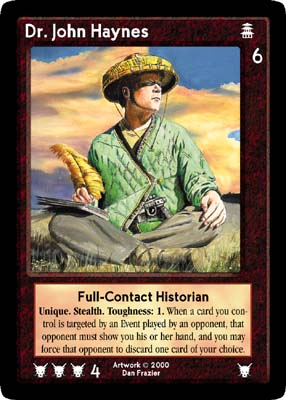
Dr. John Haynes
started life as a 3 cost / 4 Fighting utility character along the lines of Serena
Ku. He was an idea from the old Deadalus archives; we placed him in Throne War
since he appeared in the Feng Shui supplement Thorns of the Lotus (his character
isn't described, but he "writes" the sidebars in the book). Daedalus even had
an art description written, so we used that too. His original ability didn't
survive playtest, but the art description did, more or less.
| Dr.
John Haynes |

A
white man in simple ancient Chinese garb and wearing a wicker hat balances
a notebook and pen on his knee while he spies on/observes something in
the distance. He's packing a pistol (maybe he's holding it) just in case
things go wrong.
Admire the hat, even as it kicks your butt.
|
Dan Frazier sent
an advance sketch of Dr. John fairly early in the testing period. That was unusual;
most of the artists didn't send sketches (or, to be more precise, we didn't
see them if they did). Zev forwarded it to us, and we all reacted the same way:
"He needs to kick more ass." The hat, the gun, the lookDan had hit the art
description just right (this is one of those cases where the piece comes in,
and looks better than you imagined). Well, except for one thing: Daedalus described
Dr. John as a black man, but somewhere along the line that got dropped from
the art description, so it's not Dan's fault. And anyway we didn't want to quibble
with that hat :)
Dan's sketch gave
us a reason to change Dr. John from a utility character to a top-notch hitter.
The art was just too good for someone with a supporting role; Dr. John needed
to be a star. So we beefed up his Fighting and gave him a more powerful set
of abilities to be worthy of that hat. Dr. John's design is another story [someday,
that will be a link to the next design article], but I think he lives up to
his artwork now. And Dan's finished artwork was everything the sketch set it
up to be, which makes sense, since Dan works by painting on top of his advance
sketches :)
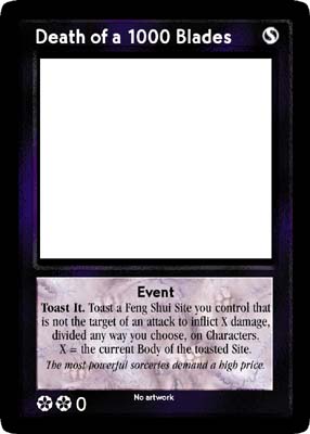
Death of Death
of a Thousand Blades
| Death
of a Thousand Blades |

We
see a burning Pagoda-style temple or similar structure in the b.g. while
in the f.g. we see a a gloating, laughing Chinese Eunuch sorcerer projecting
sharp bursts of magical energy (maybe a bit like lightning or "knives"
of energy) at a group of modern day commandos. The commandos are getting
the worst of it, writhing in pain, dropping their weapons. I think the
sorcerer's other hand should be outstretched toward the Pagoda to indicate
that the burning of the building and the magical energy are all related.
(He's not pointing at the structure, but seems to be drawing power from
the building).
One of the playtest incarnations of Death of a Thousand Blades. The main
complaint about this one was the potential to extend games and be abusable
in a deck designed around it. And yeah, it's supposed to be Thousand not
1000 but it didn't quite fit and I was too lazy to squish it today :)
|
Death of a Thousand
Blades was a card we struggled with in
playtest. We wanted the Lotus to get two new "signature" events in Throne War,
one being Die!!! and the other being Thousand Blades. We started with a card
idea found in the Daedalus archives, but Blades never quite gelled; the effect
oscillated between too weak and too strong in its various playtest incarnations.
The nail in the coffin was the art: I can't show it to you, since Zev rejected
it and it wasn't paid for as far as I know, but it just didn't come out quite
right. "Well, hmm, I guess we could...maybe if we cropped it like this...or
we could... Nevermind. This card is causing too many problems. Cut it." It's
doubly unfortunate, because the only option at that point in the cycle was to
replace Thousand Blades with a reprint that was also appearing in Year of the
Dragon, and the goal had been to keep the reprints in Throne War down to a minimum
(only cards that we thought people would want high multiples of, like Pocket
Demon and Evil Twin). [the old schoolers will ask "So then why the heck did
you reprint Kar Fai?" Even if you know the story you still won't like it, but
maybe I'll write that one up someday...]
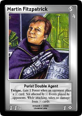
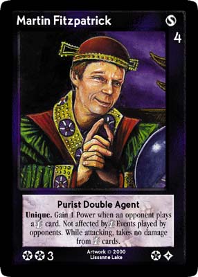
Seeing Double
| Martin
Fitzpatrick |
|
 Red-headed
Irish man from waist up. Wearing Purist robes (see Rhys Engel art ref),
head turned a little to left, one eyebrow up (give him a bored-but-sneaky
arch-villain look). If the piece needs a location, set him in a modern
or high-tech room, perhaps with laboratory gear. He is either holding
his Purist mask or it is resting in front of him (see same art ref for
mask). The same person to do this one should do Martin Fitzpatrick (b)
see description below. Red-headed
Irish man from waist up. Wearing Purist robes (see Rhys Engel art ref),
head turned a little to left, one eyebrow up (give him a bored-but-sneaky
arch-villain look). If the piece needs a location, set him in a modern
or high-tech room, perhaps with laboratory gear. He is either holding
his Purist mask or it is resting in front of him (see same art ref for
mask). The same person to do this one should do Martin Fitzpatrick (b)
see description below.
 Same
as Architect version, except his hair is almost entirely hidden under
a Chinese skullcap (a few red curls are escaping) and he is wearing ornate
Eunuch robes. His head is turned a little to the right, and he has the
other eyebrow up, but otherwise a similar expression. See Martin Fitzpatrick
(a) for more details.. Same
as Architect version, except his hair is almost entirely hidden under
a Chinese skullcap (a few red curls are escaping) and he is wearing ornate
Eunuch robes. His head is turned a little to the right, and he has the
other eyebrow up, but otherwise a similar expression. See Martin Fitzpatrick
(a) for more details..
The last playtest incarnations of Martin, with the art cropped about how
we intended him to look. The uncropped pieces appear as Hermes and Malachi
in Dark Future.
|
Martin Fitzpatrick
was intended to be something a bit differenta Character that appeared in two
versions, one Lotus and one Architect (Purist, specifically, but that was before
the Purists made their big break). Martin was a double agent, trying to work
both sides of the Lotus-Purist connection. That wasn't the only odd thing about
Martin, he was designed as a type of hoser card as well, but that's another
story [yet another hook to a page that hasn't been written yet].
The life of a double
agent is short and usually ends badly, and Martin is no exception. The art description
specified two versions, one dressed in ancient Chinese garb, and the other in
Purist regalia. They were not supposed to be twins, they were the same person
in different clothes. But the description didn't explicitly say "not twins,"
and what came back was one twin talking to another in each piece (like two ends
of a conversation). Yes, we could have altered the chrome on the card to fit
a "twins" concept rather than a double agent, or we could have messed around
with the art, but the card design was potentially unbalanced, we didn't have
much time, and we had a few too many Uniques in the set already, so chop!
both Martins dropped out...
On the bright side,
the art was certainly usable, and appeared on Hermes and Malachi in Dark Future.
For you trivia buffs, Lissanne used long-time player Andrew Davidson as the
model for the art.
Names Changed
to Protect the Innocent
Sometimes a change
to name or tag is all you have time for...
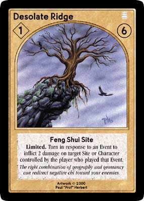
It's
Lonely Out Here
| Desolate
Ridge |

A
couple of concepts to choose from; your choice or the artists: (a) stark
scene of a high cliff with a bare tree perched on the edge (like an Ansel
Adams photograph) (b) dark night with a cliff backlit by a lightning bolt
across the sky behind it (c) as (b), but for comedy, add a guy in the
foreground with his hair standing on end, maybe looking a bit singed (this
may be hard to do without making it too cartoonish though).
My bad. I forgot to say "lightning" in option (a), and the Ansel
Adams bit didn't convey the feel I was looking for, either.
|
Desolate Ridge
was playtested as Lightning Ridge, which was a wonderful name for the ability.
I wrote the art description for it, and discovered something the hard way: if
an element is essential to a piece, don't leave it out of the description, even
if you think it's obvious from the card title. I had a hard time coming up with
a really catchy art idea for this one, so we ended up sending three optional
descriptions, and asking the artist to choose. My mistake was that the last
of these three descriptions didn't explicitly say that lightning should
be shown in the piece. And of course you know which description the artist chose
to work from :) The finished piece didn't really match that description either,
but that didn't matter when the deadline to start the print run in time for
GenCon was looming. We liked the mechanic and wanted the card to stay in the
set but there was no time to get new art, so we renamed it Desolate Ridge and
went to print that way. Lightning Ridge would've been a better name, though.
Sorry :(
One
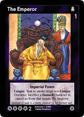
Little, Two Little, Three Little Emperors...
| The
Emperor |

Thin,
weary looking 65-yr-old Chinese man in sumptuous imperial robes sits on
the Dragon Throne. He looks bored, and tired. Behind him, to the right
of the throne, we see Gao Zhang with a smug look of satisfaction on his
face. Gao's hands are folded together inside his robe sleeves (so we don't
see his hands). Same artist should do The False Emperor.
Of the three, The Emperor came closest to what we actually wanted. The
guy in the back is recognizable as Gao Zhang. The throne didn't match,
but hey, he's the Emperor, he can have as many thrones as he wants.
|
The original plot
for Throne War started with a series of switcheroos involving the Emperorfirst,
the Lotus replace him with a demon, then the Ascended replace the demon with
their own False Emperor. The art descriptions for those three cards tried to
reflect that by indicating three slightly different versions of the Emperor:
one old and frail, one tinged blue, and one younger and hearty. And of course
their faces would have to look the same, so the intent was to have a single
artist do all three pieces. Somehow that part got lost, and the three were assigned
to different artists. Bummer.
| Demon
Emperor |

He
should look like The Emperor, but stronger, more vital and robust, and
with a slight bluish tinge to his skin (enough to be obvious, but not
enough to yell BLUE at us). Dressed in fine yellow robe, he's in Gao Zhang's
room, peering at a large book open on a stand. There is a diagram inscribed
on the floor, with some energy beginning to form in the middle. Perhaps
we can see other demons starting to form/come through this area. He is
acting sneaky, secretly summoning more demons.
We didn't have space to print a tag line to explain why the Demon Emperor
didn't quite look like the Emperor. At least he was blue :)
|
The Demon Emperor
definitely came in blue, but more of an Emperor of Demons rather than one taking
the place of the Emperor. We had already planned that he would be a shapechanging
demon, so it really didn't matter that he looked nothing at all like the Emperor.
Really. That's what we said, over and over. Sigh.
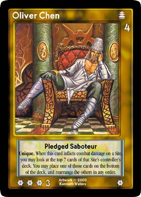
| Oliver
Chen (commissioned as The False Emperor) |

A
human employed by the Ascended to impersonate the ailing Emperor. His
problem is that he looks too strong and robust! Give him a concealed weapon
he's slipping out of his sleeves: most un-Emperor like! Same artist should
paint "The Emperor." Either focus on him alone, or he could be sitting
on The Dragon Throne, slouched in a flippant sort of way (maybe even one
leg over the arm of the throne) with a stern looking eunuch standing behind
the throne, to one side.
The lounging part came out right, but not the "looks like the emperor"
part. Rename, print, fix story later (much
later...)
|
When the False
Emperor came in, he was lounging on the throne as requested, but didn't look
enough like the Emperor to be an imposter. We couldn't get away with a simple
tag line to patch it up because there was no room on the card, so the plotline
for the double switcheroo was scrapped from the backstory. But we didn't want
to drop the card mechanic entirely so the card was renamed Oliver Chen, Pledged
Saboteur, and the rest is ancient Chinese history...
Hindsight is 20:20
Digging into the
historical archives, it turns out that Daedalus changed card names more often
than Z-Man does, but it happens a lot in both companies. If you ever talk to
one of the artists about a specific piece, it helps to have a copy of the card
to make sure they know what you're talking about; there's no guarantee that
the name they received with the art description is anything like the name the
card is printed with. Here's just a sampling:
Netherworld:
- Desire Manipulator
began life as Subliminal Broadcast
- Sucker Rounds
started out as Tracer Resin Projector, but was renamed after the art came
in. The Tracer Resin Projector appears in the main Feng Shui RPG rulebook
p.124 if you're interested.
- Darkness Priestess
was a Priest to begin with; it was changed after the art came in (and afterward
caused all sorts of fun with the designator rulings :)
- Furious George
was SAM Simian to start with (a card with that name appears in Dark Future)
- Sibling Rivalry
started out as EMP Pulse
- Pocket Demon
was Abstraction Spirit to start (an indicator of the Purists to come? :)
- Netherworld
Return was Portal Ambush.
Flashpoint:
- Scrappy Kid's
art was commissioned as a Hand card called The Torch of Tomorrow
- Cyclone of Knives
was originally titled Death of a 1000 Blades (no relation to the card
tested in Z-Man's Throne War)
- Plasma Trooper
was Incendiary Beast in its first life, and is still listed this way on Rob
Alexander's website.
- Stunt Man was
Karate Cop, and Coffee-Stained Cop was originally Rookie Cop (and cards with
those names have since been printed by Z-Man)
- Red Monk was
Flame of Freedom to begin with.
- Colonel Griffith
was originally called Colonel Richtmeyer (a card with that name appears in
Dark Future)
- Cheap Punks
were called plain old Miners at first.
It's Here, Let's
Use It
Most times in the
construction of a set, you commission more art than you know for certain you
will use, just in case a card gets cut late in the cycle or an artist doesn't
come through on deadline (which doesn't happen that often, but often enough
that it must be planned for). But it's usually only a few pieces, because the
artists get paid whether the piece is printed or not, and your budget isn't
infinite.
Since the art is
already paid for and you have it in hand, there's a strong incentive to use
that piece in a future set. In Netherworld and Flashpoint, for example, a lot
of art was originally intended for the Combat in Kowloon and 2nd edition Shadowfist
sets that never materialized, and some is leftover from Limited Edition. Here
are just a few:
Pieces done for
Combat in Kowloon:
There's nothing
Dragon-specific about Kar Fai's Crib, since it was originally done for a feng
shui site called Temple Street.
| Mr.
Big |
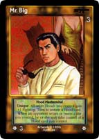
The infamous ears on Mr. Big's shadow don't mean that he's a transformed
anything. He may have latent demonic tendencies, though.
|
Many people have
noticed the little pointy ears in Mr. Big's shadow, and speculated that he
must be a transformed animal of some kind. That may be the rationalization,
but the art was originally done for a card called Lord of the Underworld.
The card design I found in the Daedalus archives was for a Hood Edge, so Underworld
was meant to mean criminal underworld, but I think the artist took it as demonic
underworld, hence the pointy ears in the shadow.
Jimmy Wai was
originally named Sneezy Teng.
Eugene Fo was originally named Happy Cheung.
Chimp Shack
was Construction Shacks.
Sneezy and Happy
were two Lotus goons in the Combat in Kowloon story, and the construction
site was where they had a hideout. (and just to head it off, there is no record
of Doc, Sleepy, Grumpy or any of the other dwarfs appearing in the story).
Some pieces done
originally for Limited Edition that ended up in Netherworld:
The first version
of Kan Li was printed as Shinobu Yashida.
An alternate
Sinister Priest illustration became Jueding Bao-Fude.
I thought these
last two were notable, since Z-Man also ended up with two versions of some pieces
through odd circumstances...
Flashpoint itself
generated leftoversyou've seen several now in Z-Man editions, one of the most
recent being Fortress Omega in Dark Future. That piece was done by Mark Tedin
in 1996 along with the other Arcanotowers, and was originally titled "Arcanotower
69" (I'll leave that one alone, no comments from the peanut gallery please)
It works quite well as Fortress Omega, since there wasn't anything in the art
that tied it to the ancient China juncture.
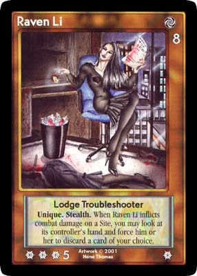
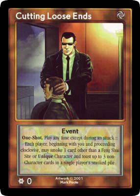
| Cutting
Loose Ends vs. Raven Li |


It's like a shell game sometimes. Femme Fatale becomes Cutting Loose Ends,
then later becomes Raven Li, a different leftover piece gets pulled in to
be Cutting Loose Ends... (link
to Néné's website required for permission to show her art) |
In an interesting
twist of art and title, Néné Thomas' 1996 piece called "Femme
Fatale," which was intended for a Daedalus card called "Cutting Loose Ends,"
ended up as the character Raven Li in Netherworld 2. Cutting Loose Ends also
appears in that set, although with Throne War leftover art from Mark Poole in
place of Néné's.
Another of Néné's
older works was intended for Combat in Kowloon but finally made an appearance
as Poison Thorns in 10,000 Bullets.
And of course there
have been leftovers from Throne War that have popped up since. Ravenous Devourer
used art that was intended for a different beast in Throne War but became available
because of the odd circumstances obliquely mentioned up above (bonus points
if you can guess which card in Throne War the Devourer might have been).
The Man With No
Name has also been sneaking in at regular intervals. No, not the guy wearing
Freddy Krueger's cast-off sweater in Netherworld 2the original concept for
a card with that name (heh, sorry) had been as a promo card for the Secret War
Society. He was cast as a nameless hero who secretly steps in on any side in
order to keep a balance of sorts in the War. He was to be printed in seven versions,
one for each faction. We pushed this idea too late in playtest, thoughsome
of his incarnations were too good, and others too weak, and we didn't have time
to reconcile them. And playtesters also brought up concerns about availability
and power level of promos, so that idea was scrapped, but not before Mark Poole
had created the art for all seven incarnations. You've seen the Man With No
Name in many sets since that time, but true to his concept, you didn't know
who he was...
There are a lot
more stories waiting to be told (and many more from the newer sets that I'm
blissfully unaware of, I'm sure), but in the interest of actually publishing
this before the decade is out, I'll stop here. Thanks to Zev for allowing me
to post this peek behind the scenes!
back
to top
Legal
Stuff | Terms of Use | Privacy
Policy | About Me | Contact
Me